
You can use Matplotlib to create a line chart with Python. Matplotlib is a plotting library for the Python programming language and its numerical mathematics extension numpy.
A line chart is the right chart when one value changes over another, over time or in order. Matplotlib calls it a plot, you give it x values and y values and it draws the points and the line between them.
Line chart
The code creates a line plot in a graphical desktop window. This takes only a few lines. The dataset can be any set of numbers, in the example below we simply picked some random numbers for x.
import numpy as np |
In the first two lines we include the numpy and matplotlib library. This contains logical functions to create line charts amongst others.
We define a list named x with a few random numbers and we set the x and y label. Finally we call the function show() which will display the line chart. If you do not call the show() function, nothing will be shown on the screen.
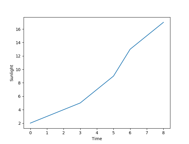
Line plot colors
Plots support theming. It’s very easy to change the color of the line or the shape of it. By changing the plot function call to:plt.plot(x, 'ro-')
The steps
import matplotlib.pyplot as plt. The name plt is the usual short one.- Create a figure with
plt.figure(). You can pass a size in inches. plt.plot(x, y)draws the line. Add a second call with different values and Matplotlib picks a second colour.plt.title('...'),plt.xlabel('...')andplt.ylabel('...')name it.plt.grid(True)adds a grid, which makes values readable.plt.legend()adds a legend when you plotted more than one line.plt.show()opens the window.plt.savefig('chart.png')writes a file instead.
Useful extras: plt.xlim(0, 10) sets the range on an axis,
plt.plot(x, y, 'o') draws dots instead of a line and
plt.scatter(x, y) is meant for points with no order.
The fastest way to learn this is to write it yourself. The PyChallenge exercises run in your browser, no install needed.
I have a recommendation: it would be nice if you stated what version of python you are referring to in this tutorial, as well as tell users about installing libraries. This example uses numpy and matplotlib, which (at least in my case) were not part of python installation by default
Can you please describe where the alias np start his action or say what does it (np) do in this code lines ? Thanks a lot !!
what is use of import numpy as np in code?
That line can be removed
This line is not needed, it imports a module.
it gives me an error
would it be because i have multiple versions of python installed in my linux.?
Multiple python versions is not a problem, install matplotlib: pip install matplotlib
how can I install matplotlib? I have the same problem as Ayush!
for other systems there is an install guide here: http://matplotlib.org/users/installing.html