
The module pyqtgraph supports all kinds of charts and scientific graphics. Officially it’s the “Scientific Graphics and GUI Library for Python”. Underneath, pyqtgraph uses PyQt4 / PySide and numpy. Its been tested to work on Linux, Windows, and OSX.
A bar chart is the first thing you draw when you compare categories. pyqtgraph has
BarGraphItem for it, and it takes plain numbers, so you do not need to
learn a second charting library.
In this article we’ll create an example bar chart. The output will be this awesome chart:
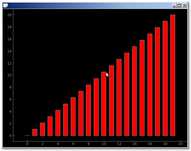
pyqtgraph barchart
PyQtGraph is a pythpn graphics module built on top of PyQt and numpy. It’s end users are mathematicians, scientists and engineers. Lets do an example. We create the data to plot (x y1) first. y1 is a list of 20 floats that we create using the numpy method linspace.
Then create the barchart using the method BarGraphItem(), where the parameters are x, y, bar width and color.
# pyqtgraph examples : bar chart |
Building the data
numpy.linspace(0, 10, 20)gives you 20 evenly spaced values. Handy for a demo.BarGraphItem(x=x, height=y, width=0.6)places a bar at every x position.plotItem.setLabel('bottom', 'index')andsetLabel('left', 'value')name the axes.widget = pg.GraphicsLayoutWidget()is the window you add the plot to.widget.addItem(item)puts the bar chart on the widget.widget.show()opens the window.
Change brushes to give the bars different colours. A single colour with a
little transparency usually reads better than a rainbow.
If you want to try this yourself, the exercises on PyChallenge turn the same idea into a few short problems with instant feedback.