
A simple plot can be created with the module pyqtgraph. Mind you, it’s one of the libraries for plotting, there are others like matplotlib.
pyqtgraph draws charts inside a Qt window, so the chart is part of your program instead of a separate window. That is the difference with Matplotlib, which opens its own window.
For a one off plot, Matplotlib is fine. For an app with a chart that updates while the user works, pyqtgraph fits better.
pyqtgraph draws charts inside a Qt window, so the chart lives in the same program as the rest of your interface. That is the difference with Matplotlib, which opens its own window.
For research plots, Matplotlib is fine. For an app with a live chart, pyqtgraph fits better.
We start with importing pyqtgraph and defing the plotting data (x and y). Then we plot the data using pg.plot().
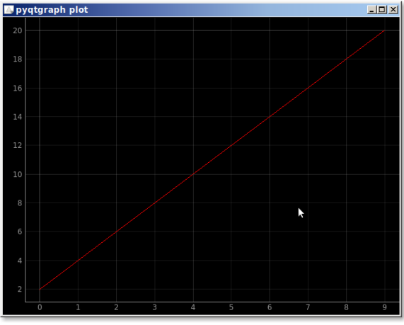
pyqtgraph plot
The example below creates a plot using pyqtgraph.import pyqtgraph as pg
import pyqtgraph.exporters
import numpy as np
# define the data
theTitle = "pyqtgraph plot"
y = [2,4,6,8,10,12,14,16,18,20]
x = range(0,10)
# create plot
plt = pg.plot(x, y, title=theTitle, pen='r')
plt.showGrid(x=True,y=True)
## Start Qt event loop.
if __name__ == '__main__':
import sys
if sys.flags.interactive != 1 or not hasattr(pg.QtCore, 'PYQT_VERSION'):
pg.QtGui.QApplication.exec_()
We can set additional properties of the chart like the labels, add a legend, the colors.
The output will look like this: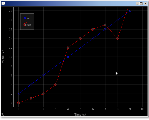
In code its like this:import pyqtgraph as pg
import pyqtgraph.exporters
import numpy as np
# define the data
theTitle = "pyqtgraph plot"
y = [2,4,6,8,10,12,14,16,18,20]
y2 = [0,1,2,4,12,14,16,17,14,22]
x = range(0,10)
# create plot
plt = pg.plot()
plt.showGrid(x=True,y=True)
plt.addLegend()
# set properties
plt.setLabel('left', 'Value', units='V')
plt.setLabel('bottom', 'Time', units='s')
plt.setXRange(0,10)
plt.setYRange(0,20)
plt.setWindowTitle('pyqtgraph plot')
# plot
c1 = plt.plot(x, y, pen='b', symbol='x', symbolPen='b', symbolBrush=0.2, name='red')
c2 = plt.plot(x, y2, pen='r', symbol='o', symbolPen='r', symbolBrush=0.2, name='blue')
## Start Qt event loop.
if __name__ == '__main__':
import sys
if sys.flags.interactive != 1 or not hasattr(pg.QtCore, 'PYQT_VERSION'):
pg.QtGui.QApplication.exec_()
The parts you need
pg.plot(x, y)draws the data and returns a plot item you can keep.plotItem.setLabel('bottom', 'time', units='s')sets an axis label.plotItem.setTitle('temperature')sets the title.plotItem.addLegend()turns the legend on, useful with more than one line.plotItem.showGrid(x=True, y=True)adds a grid, which helps read values.pyqtgraph.exporterswrites the plot to a PNG or SVG file.
Passing pg.setConfigOptions(antialias=True) once at the start makes the
lines look smoother.
The parts you need
pg.plot(x, y)draws the data and hands back a plot item you can keep.plotItem.setLabel('bottom', 'time', units='s')names an axis.plotItem.setTitle('temperature')sets the title.plotItem.addLegend()turns the legend on, useful with more than one line.plotItem.showGrid(x=True, y=True)adds a grid, which makes the values readable.plotItem.setYRange(0, 100)fixes the range on an axis.pyqtgraph.exporterswrites the plot to a PNG or SVG file.
Call pg.setConfigOptions(antialias=True) once at the start of the program
and the lines look smoother. widget = pg.GraphicsLayoutWidget() is the
window, widget.show() opens it.
Want more practice on this? Practise this on PyChallenge, there are short browser exercises you can run right after reading.