
The KMeans clustering algorithm can be used to cluster observed data automatically. All of its centroids are stored in the attribute cluster_centers.
Every cluster that k-means finds has one centre, a point that sits in the middle of
its group. In scikit-learn those centres are in the attribute
cluster_centers_, one row per cluster.
Plotting them on top of your data shows what the algorithm actually did, and that is often not what you pictured when you picked k.
Every cluster that k-means finds has a centre. In scikit-learn the list of those
centres is in the attribute cluster_centers_.
Plotting them on top of your data shows you what the algorithm actually did, which is often not what you expected.
In this article we’ll show you how to plot the centroids.
KMeans cluster centroids
We want to plot the cluster centroids like this:
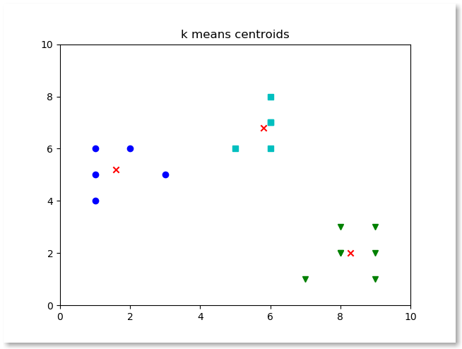
First thing we’ll do is to convert the attribute to a numpy array:centers = np.array(kmeans_model.cluster_centers_)
This array is one dimensional, thus we plot it using:plt.scatter(centers[:,0], centers[:,1], marker="x", color='r')
We can plot the cluster centroids using the code below. # clustering dataset
from sklearn.cluster import KMeans
from sklearn import metrics
import numpy as np
import matplotlib.pyplot as plt
x1 = np.array([3, 1, 1, 2, 1, 6, 6, 6, 5, 6, 7, 8, 9, 8, 9, 9, 8])
x2 = np.array([5, 4, 6, 6, 5, 8, 6, 7, 6, 7, 1, 2, 1, 2, 3, 2, 3])
# create new plot and data
plt.plot()
X = np.array(list(zip(x1, x2))).reshape(len(x1), 2)
colors = ['b', 'g', 'c']
markers = ['o', 'v', 's']
# KMeans algorithm
K = 3
kmeans_model = KMeans(n_clusters=K).fit(X)
print(kmeans_model.cluster_centers_)
centers = np.array(kmeans_model.cluster_centers_)
plt.plot()
plt.title('k means centroids')
for i, l in enumerate(kmeans_model.labels_):
plt.plot(x1[i], x2[i], color=colors[l], marker=markers[l],ls='None')
plt.xlim([0, 10])
plt.ylim([0, 10])
plt.scatter(centers[:,0], centers[:,1], marker="x", color='r')
plt.show()
Plotting the centroids
- Convert it with
np.array(kmeans.cluster_centers_)so you can use numpy. - The array has shape (k, 2) when your data has two features.
- Split it with
centroids[:, 0]andcentroids[:, 1]for the x and y values. - Plot them with
plt.scatter(x, y, marker='x')so they stand out from the data points.
If the centroids land in the middle of the clouds but the clusters still look wrong, then k is probably wrong. Use the elbow method to check.
Plotting the centroids
- Convert it with
np.array(kmeans.cluster_centers_)so numpy can use it. - The array has one row per cluster and one column per feature.
- With two features,
centroids[:, 0]holds the x values andcentroids[:, 1]the y values. - Plot them with
plt.scatter(x, y, marker='x', color='red')so they stand out from the data points.
If the centroids sit right in the middle of each cloud but the groups still look wrong, k is probably wrong. Use the elbow method to pick it. If a centroid ended up far from any data, that cluster is probably too spread out for k-means and another method fits better.
If you want to try this yourself, the exercises on PyChallenge turn the same idea into a few short problems with instant feedback.